.png)
.png)
Knowing the pains of public transportation from my college days, I was excited to tackle a problem I had familiarity with. For my first-ever Thinkful Bootcamp assignment, I was asked to design a bus-tracking application for the state of Washington.
Roles
-
Researcher
-
Designer
-
Writer
-
User Tester
Tools
-
Figma
-
Google Suites
-
Vectr
-
Usertesting.com
Timeframe
-
Three Weeks
The Challenge
GoMetro is a simple app for public transportation users of all frequencies. The prompt was to keep the app as simplistic as possible while learning the basics of UX/UI design. With the aid of the Double Diamond Design Process, I learned to Discover, Define, Develop and Deliver. With "keep it simple stupid" as my mantra, I dove in!

Project Overview
Our client was the city's transportation agency with a network of public buses. They currently list the expected bus schedule on their website and post it at each bus stop. They have the technology to know how far away each bus is from their next stop but weren't sure how to go about sharing the information.
PROBLEM
-
Due to route expansions(adding seven additional bus lines to at least one stop), users were often unsure as to what bus to board.
-
Situations like heavy traffic, the need for longer stops to assist passengers using wheelchairs, and taking a bus out of service for maintenance were impacting posted schedules.
SOLUTION
I needed to design an app that would:
-
Allow users to view future arrival times for each bus line.
-
Allow users to know how much time they had to arrive at their stop.
-
In real-time allow users to view when each bus was going to arrive at their stop.
1) Empathize
While I was given some truly invaluable direction, thanks to the hypothetical transportation agency, I needed to do a deep dive into user needs. Through surveys, interviews, and competitive analysis, I would glean new information to shape my first design project.
SURVEYS
I ran Google Forms surveys with 20 participants. 1) I learned that there was no standout user demographic in terms of age, gender or education level. 2) More than 69% of users experienced late buses. 3) That more than 64% of users reported accidentally boarding the wrong bus at some point.
USER INTERVIEWS
To gain a deeper understanding of how bus users think, I needed to interview a known bus user. I prepared a session guide, a materials checklist, and a script for my interviews. Notable quotes include:
-
"I'm always worried about getting distracted and missing my stop"
-
"If I knew my bus was going to be ten minutes late, I would've stayed inside longer. It gets hot here."
-
"It would be really neat if there was some sort of in-app thing to remind me when to get off the bus"
COMPETITIVE ANALYSIS
With so many transportation apps out in the world, I knew I had ample resources to pull inspiration. I downloaded and tested well-known transit applications. This process gave me several insights into what they did well, did poorly and what I could do better.
Moovit
Strengths
-
Has ability to set favorites
-
Has live bus arrival times
-
Has exit notifications
-
Has ability to set alerts
Weaknesses
-
Accessibility issues with color/type
-
Visual hierarchy problems
-
Confusing navigation
-
Too much information on one page
Takeaways
-
I would need a cleaner design to avoid overwhelming the user.
-
Easy access navigation is important, especially while traveling in new territory.
Google Maps
Strengths
-
Gives audio directions
-
Gives detailed information on user's destination
-
Has a clean, easy to use design once the user starts their trip
-
Has a reporting feature for incidents
Weaknesses
-
Accessibility issues on active transit page
-
Possibly too much information displayed at once
-
Location and personal habit information tracked by google
Takeaways
-
While I would love to work in all of the bells and whistles that google boasts, I didn't have that kind of time. I would need to keep the focus on the basics.
-
Once their user starts a trip, the app looks clean and provides clear directions.
2) Define
By defining the audience, I would be able to define a point of view based on user needs and insights. During this stage, I built user personas and user stories.
USER PERSONAS


While in very different demographics, Azem and Sarah have very similar needs. Keeping empathy in mind, I wanted to be sure I kept simplicity and readability at the forefront of the design.
USER STORIES
With all of the data that I'd put together so far, I was ready to define the high-priority user stories. Three of these were provided to us at the start of the project but thanks to what I learned in the discovery phase, I had an additional user story to cover.


USER FLOW
.png)
SITE MAP
.png)
3) Ideate
Based on the insights that I had collected from my user research, I sketched wireframes before building low-fidelity wireframes. I continued to speak to users for feedback through in-person user testing and made iterations throughout the remainder of the project.
WIREFRAME SKETCH
.jpg)
DIGITAL WIREFRAME


4) Prototype & Validate
During the high-fidelity wireframing and prototyping phase, I learned about Apple's Human Interface Guidelines. You will see that I ran into quite a few challenges that required several rounds of user testing. With the aid of Usertesting.com and in-person reviews, my prototype changed dramatically.
CHALLENGE # 1 - ONBOARDING
-
Challenge: A user said they found buttons difficult to click.
-
Solution: I referenced several of Apple's guidelines to increase button padding and improve overall usability.

Iteration #1

Iteration #2
CHALLENGE # 2 - INPUT PADDING & PLACEMENT
-
Challenge: The same user had an issue with clicking input fields and was confused as to what the icons in the search field represented.
-
Solution: Another learning opportunity, I researched and learned more about overall padding and the need to have icons more accurately represent fields.

Iteration #1

Iteration #2
CHALLENGE # 3 - BUTTON AND NAVIGATION PLACEMENT
-
Challenge: Another user found the app's overall navigation awkward to access.
-
Solution: Again, I learned more about accessibility and how users generally prefer navigation to be placed at the bottom of the screen.

Iteration #1

Iteration #2
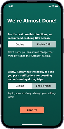
CHALLENGE # 4 - APPLICATION SETTINGS
-
Challenge: A user seemed generally confused about how to enable the app's GPS and notification function.
-
Solution: I rolled all settings into the onboarding phase with the user having the option to change settings through the new nav bar.

Iteration #1
Iteration #2
Final Deliverables
To date, I have designed a total of 9 screens and I will continue to update.


Takeaways
The process of designing my first application was equal parts humbling and educational. The importance of both user and personal research very much set the stage for my understanding of user experience. Learning to keep the focus on the needs of my user personas, was challenging and rewarding. Azem was provided with a simple and accessible app for all dexterity and technical knowledge levels. Sarah now has a sleek application that allows for her busy schedule and life goals. I learned that only through the combination of usability and accessibility is an app truly for everyone.
My background in branding and visual merchandising aided me here. While I've always known that I have a good eye for displays and "wow moments", the scope of options for color and style had never been so open. Thanks to the use of a color wheel and research, you can see that the aesthetics of the app improved dramatically.
I am beyond excited to develop this app further in the future and continue my journey into the world of design!

